Friday 3 June 2016

Is Toronto's suburban poverty shifting towards lowrise housing?

In the last decade, a lot of attention has been given to the suburbanization of poverty in Toronto. Although the process has been going on for several decades, it has recently reached the point where most of the low income census tracts are in post-WWII neighbourhoods. That's likely due in part to the outwards expansion of poverty following the outwards expansion of Toronto in general, but also due to increased gentrification of the core.

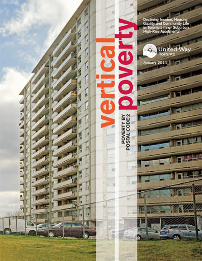
Most of the media and organizations discussing the issue have been highlighting the concentration of poverty into rental apartment buildings that were built in auto-oriented inner suburbs in the 60s and 70s.

However, a recent series of maps using 2012 taxfiler data suggests that poverty may now be shifting towards more low-rise neighbourhoods in even more distant suburbs of Toronto.

Here's the map of the current income distribution of Toronto, with census tracts coloured based on median per capita income of adults (aged 16+).
Brown: <60% of CMA average (very low income)
Pink: 60-80% of CMA average (low income)
Beige: 80-120% of CMA average (medium income)
Light Blue: 120-140% of CMA average (high income)
Dark Blue: >140% of CMA average (very high income)
I've overlain when the very low income census tracts reached their very low income status. There is a loose trend of very low income areas expanding outwards with time.

Where it gets interesting is the break-down by unit type.


The census tracts that reached very low income status before 2000 had virtually no detached SFHs and significantly above average amounts of apartments. However, the census tracts that became very low income between 2005 and 2012 actually had below average amounts of apartment buildings, with above average amounts of townhouses and duplexes (typically houses with basement apartments) and only slightly below average amounts of detached SFHs.

It's not just a matter of there not being any more census tracts with high percentages of apartment buildings, there are still plenty of those that are not very low income.

I also modified the map to show the unit type breakdown of Toronto's very low income census tracts.

Yellow = no apartment buildings
Green = <1/3 of units are in apartment buildings
Light blue = 1/3 to 2/3 of units are in apartment buildings
Dark blue = >2/3 of units are in apartment buildings
The very low income census tracts in the core and inner suburbs do have a lot of apartments, but further out, not so much. So are most of the apartment dominated census tracts located in the core, so that due to the better location, they are less likely to be very low income? A lot of them are.

However, not all. The condo neighbourhoods of central North York are not very low income, although it's true that despite further from the core, they still have subway access and many amenities. There are also still census tracts in the NE and NW inner suburbs with a lot of apartments that are merely low income, rather than very low income, such as in Brookhaven-Amesbury, Weston, and a few highrise clusters in south-central Scarborough.

Richmond Hill, Mississauga and Thornhill also have a fair bit of apartments and condo towers. That's despite being far from downtown, although those are arguably in the "favoured quadrants" of Toronto, and closer to suburban job centres. The apartments in the NE and NW inner suburbs, despite often being beyond the pre-WWII core and away from rapid transit, are still about 45min from Downtown by transit, with decent access to suburban jobs, so it could be worse.

However, even in the more distant NE and NW suburbs like Brampton and Miliken, there are some neighbourhoods with older condos, apartment buildings and townhouses that have a bit higher per capita incomes than the SFH dominated very low income census tracts of these same communities. Perhaps this is due to a combination of these areas having a relative undersupply of apartment buildings and many basement apartments and multi-generational households?

Were the last few years a temporary anomaly? Will very low income areas shift back towards apartment dominated suburban neighbourhoods?

Or is there a more permanent shift taking place? One where although there is an undersupply of SFHs in core neighbourhoods and desirable suburbs, most available land for new SFHs is in lower demand NE and NW suburbs? Or are SFH neighbourhoods simply going to be better able to accommodate lower income people through multi-generational households and basement apartments?

Friday 4 December 2015

Transit for Scarborough

For anyone following discussions of transit in Toronto, the debate on how to provide transit to Scarborough has been front and centre. Scarborough consists largely of older moderately dense post-WWII suburban neighbourhoods, and has become home to a large portion of Toronto's lower income population in recent decades and has relatively high transit mode share (20-40% in most neighbourhoods). However, it remains relatively disconnected by transit from central Toronto.

Early plans for Scarborough included two subways with Scarborough Town Centre being a major focus. Scarborough Town Centre was intended to be the downtown of Scarborough, although it has not developed to quite the level initially anticipated. It now consists of a shopping mall surrounded by a few condo towers, office buildings and civic buildings.

The transit plan was to have one subway line running along Sheppard Ave E connecting Scarborough Town Centre to Downsview, and a rapid transit using somewhat different technology from the rest of the subway system connecting Scarborough Town Centre to the Bloor-Danforth Subway at Kennedy Station and to Malvern called the Scarborough RT.

The Sheppard Subway was only partially built in 2002, the section from Yonge & Sheppard to University-Spadina subway at Downsview Station, and the section through Scarborough from Don Mills to Scarborough Town Centre unbuilt. The Scarborough RT only built up to Scarborough Town Centre rather than Malvern, and is now in need of replacement for various reasons.

As a result, there have recently been many different proposals for the construction of rapid transit line extensions and new transit lines to Scarborough. These include extending the Bloor-Danforth Line along the Scarborough RT right of way or perhaps a slightly different route, and extending the Sheppard East subway into Scarborough. One alternative has been do build these as light rail lines, along with additional light rail lines along Markham Road, Kingston Road and Morningside Avenue. Finally there are plans to improve service along the commuter rail lines of Toronto, two of which pass through Scarborough, by increasing frequencies, operating hours (one rail line is rush-hour only) and electrification which could allow for either faster travel or additional stations. This would allow these rail lines to function much more like rapid transit and boost their usefulness to Scarborough residents.

One major criticism of the subway plan is that the low densities will result in ridership levels too low to justify the high cost of subways, with the existing Sheppard East subway, and sometimes Scarborough RT cited as examples or rapid transit in similar moderate density suburbs with low ridership. Another related criticism is that due to the wider stop spacing (and shorter length due to higher costs) the subway will serve fewer people than LRT due to fewer people within walking distance of stations.

However, here is a map showing the commuter shed of some of the relevant currently existing transit lines. This is based off the fastest transit route that google recommends for getting from various parts of the city to Yonge and Bloor (more or less downtown). Red is the commuter shed of the Sheppard East subway, light blue is the portion of the commuter shed of the Bloor-Danforth subway that's within Scarborough, and black is the commuter shed for the Scarborough RT.


So clearly for most people in Scarborough, the Bloor-Danforth Subway is the best option. For most people in Scarborough, this doesn't involve walking to the subway, but rather getting on a bus and then transferring onto the subway. Note how small Sheppard East's commuter shed is by comparison, even including the portions within North York. This suggests that density plays only a relatively small role in Sheppard East's low ridership, and that how it fits into the overall transit network is bigger problem.

How so? The commuter shed is largely restricted by competing bus routes as Sheppard East functions merely as a feeder line for the Yonge Subway. For areas near Finch Ave E or Steeles Ave E, it's faster to take the bus along these roads and transfer onto the Yonge Subway at Finch Station than to take the bus and transfer onto the Sheppard Subway and then transfer again onto the Yonge Subway. The 199 Finch Rocket seems to be especially competitive, being an express route. South of the 401, it is again faster to take various bus routes to the Yonge Subway directly rather than the Sheppard Subway, and in most of Scarborough, it's faster to take various buses down to Kennedy, Warden or Victoria Park stations on the Bloor-Danforth Line. Further out towards the suburban outskirts in York Region, Durham Region of the furthest reaches of Scarborough, GO commuter buses and trains tend to be more competitive.

The problem is that the Sheppard Subway is too short to make sense as a subway line, especially being in a relatively low density setting far from downtown with relatively few major destinations along the Sheppard Subway, especially when it comes to major destinations that are difficult to get to by car. While subways are generally faster than buses, they partly achieve this by making fewer stops. Since North York already has the Yonge Subway, the speed advantage is the Sheppard Subway is only realized over a short distance, limiting the amount of time saved over buses.

For example, if you want to from Finch and Leslie to Yonge and Sheppard, you can either travel 4 km  east at bus speeds and 2 km south at subway speeds (Yonge Subway), or 2 km south at bus speeds and 4 km east at subway speeds (Sheppard Subway). So the difference is 2km at bus speeds vs 2km at subway speeds. However, taking the Sheppard Subway will involve walking more to reach transit and an additional transfer. Or if you happen to live really close to the arterial intersections, walking distance might be similarly short, but you can take the 199 Rocket which is almost as fast as the subway but requires one less transfer.

However, these arguments don't necessarily apply to a Bloor-Danforth extension further into Scarborough since there are currently no major competing rapid transit routes anywhere close by. As a result, if none of the other transit proposals for Scarborough are built, the existing commuter shed within Scarborough will be better served. The areas from Eglinton southwards in SW Scarborough would feed into the existing portions of the Bloor-Danforth subway and so quality of service would be similar. However, central Scarborough around Lawrence, Ellesmere and Sheppard would be better served. A Scarborough subway extension could even "poach" riders from North Scarborough who are currently taking buses along Finch and Steeles to the overcrowded Yonge Subway.

When you include transit riders taking the bus to subway stations rather than just walking, a Scarborough subway would impact the entire area of Scarborough, a much larger population than Sheppard East's commuter shed, at about 600,000 people vs less than 100,000.

Will this be enough of a difference to justify a subway? Hard to say, people would probably be more likely to take the subway or other rapid transit if it's within walking distance rather than having to take a feeder bus. Still, feeder buses are certainly important. The existing subway stations in Scarborough like Warden and Kennedy which have feeder bus routes get several times higher ridership than many stations in central Toronto that are higher density but lack major feeder routes. It also doesn't mean that the Bloor-Danforth Extension should be made unnecessarily expensive just to be able to say it's a subway. If the existing Scarborough RT infrastructure can be used in a way that will significantly reduce costs over a tunnel-bored subway along McCowan, I think it should be. As long as the route is grade-separated, it doesn't matter that much if it's underground or not.

There is a big if though, which is "if no-other significant competing rapid transit routes are built". So if the Ontario government remains committed to upgrading the commuter rail network, or funding can be gotten for multiple Scarborough light rail lines, a Scarborough Subway may not be necessary. It's important to have good communication between Toronto and the provincial and federal governments.

At the same time, if the Scarborough Subway does turn out to be unneeded, it's also important to ask if a light rail line along the Scarborough RT corridor makes sense, and whether multiple alternative lines could do the job better. If there are several competing lines, a transfer required at Kennedy Station, and short stop spacing, usage might be relatively low. This is especially true when considering a good chunk of the Scarborough RT goes through low density industrial areas with restrictions to redevelopment into high density TOD offices and housing, whereas most of the Sheppard East Subway corridor is seeing a great deal of intensification.

Monday 14 September 2015

US MSAs urban vs suburban growth - Raleigh and the Inland Empire

In part 6 of this series, I found that, out of the 1,000,000+ population MSAs, Raleigh and the Inland Empire experienced the most urban core growth relative to the size of their metro areas.

This is a bit surprising, because neither city is particularly well known for urban infill. These two cities were then mostly followed by the "usual suspects" of DC, Portland, Seattle, Boston, Miami and New York.

One main goal of all these comparisons was to see if I could devise a set of consistent rules to compare urban cores by, which would match relatively closely what people might subjectively view as the cores of those cities.

In the case Inland Empire, the boundaries of the urban cores seem reasonable at first glance, so how come the core is growing so fast and yet does not get much attention for urban growth? The Inland Empire is a collection of population centers inland from Los Angeles, with loose ties to LA. It has seen its Hispanic population grow significantly, perhaps in part as a result of lack of space/affordability in LA. Hispanic households are on average larger than non-Hispanic households, so I decided to see if the Inland Empire's urban core saw an increase in household sizes.

Stats for the Inland Empire's urban core

So, whatever the cause, household size increases have been the main driver of population growth in the urban core. This is in contrast with most other urban cores, where household sizes decreased slightly. If the Inland Empire experienced a slight decrease in household sizes like most other urban cores, the urban core population growth would have still been above average, but probably not in the top 10 and certainly not #2.

How about Raleigh?

The growth wasn't due to household size increases, which stayed more or less constant.
Some of the growth was at the southern edge of the city. It's greenfield development, so not true infill, but was relatively close to the core, allowing the census tracts that contained them to meet the mode share/density criteria. New subdivisions are highlighted in white, with the white lines showing the boundaries of the census block groups that contain them.

Here's an example of a typical subdivision
Although lot sizes are smaller than the older suburban development beside it, it is still single family greenfield development at the periphery with an auto oriented street network.

The largest subdivision is a bit different and has some New Urbanist elements. The street network is better connected and there are townhouses mixed in with the single family homes. It's called Renaissance Park and its website advertises proximity to the urban amenities of Downtown Raleigh, though it assumes residents will drive there. There is also mention of commercial and residential properties side by side, but unless that's referring to the strip malls just outside the subdivision, I'm not sure what they're talking about. I suppose having those strip malls nearby is better than nothing though, and it ias the reason why the community has a Walkscore of about 50, instead of the <30 Walkscore typical of suburban Raleigh.
All in all, the census block groups that contain these greenfield developments saw their population grow by 5,597, out of the 15,236 population increase in Raleigh's "urban core". That leaves 9,639 in population growth that could be described as resulting from infill. This would cause Raleigh to drop to a still quite respectable #4 for urban core population increase relative to MSA size.

So what does this infill look like? Here are the census block groups ranked by population growth.

1. The North Carolina State University Campus saw its population increase by 1582. The only residential development that seems to have taken place there is the Wolf Village student residences, circled below.

2. Downtown Raleigh grew by 976 people. There are a few smaller apartment and townhouse developments, but these two midrises seem to be the biggest new construction residential developments (based on historical aerial comparisons).

3. The census block group that grew the next fastest was in northern Raleigh, growing by 785 people, mostly as a result of these auto-oriented townhouse and lowrise apartment infill developments.

4. Next is a block group in Cary that grew by 610 people, the main development seems to have been the townhouses in the centre of this image. That's not enough to account for the entirety of the population increase, so household sizes must have gone up as well.

5. In the census block group with the 5th most growth, the infill has mostly been townhouse and apartment complexes, although there was also one cul-de-sac of SFHs (not shown). There are some offices just to the north, and some shopping centres north of those, about a 15min walk away. This block group grew by 582 people.

6. Then there's another block group in North Raleigh that grew by 505 people, with this auto-oriented apartment complex being the only noticeable new development.

7. That's followed by a block group in NE Raleigh that grew by 484 people thanks to this new townhouse complex. Since it's at least near some shopping centres, the walkscore is about 60.

8. Next, a block group in SE Raleigh that grew by 435 people. The main new development seems to be this auto-oriented infill subdivision of single family homes and lowrise apartments.
That block group also saw a few homes built on small cul-de-sacs off the old Raleigh street grid.

9. The next blog group is just next to #3 and grew by 421 people. The main new development was this auto-oriented infill subdivision of single family homes and apartments.

10. The ninth fastest growing block group was just west of downtown Raleigh, around the North Boylan neighbourhood, growing by 415 people. The growth seems to have been in the form of midrises like these.

11. The next block group grew by 389 people. Most of the development has been near a cluster of auto-oriented retail and offices, consisting of a cluster of townhouses, lowrise apartments and small lot SFH (looks a bit like townhouses in the aerial). Despite the auto-oriented nature, the close proximity to these amenities still makes for a walkscore of about 60, which is well above the Raleigh average.
There's also a smaller SFH infill subdivision in a more remote setting further NE in the same block group.

12. The next census block group is in an upscale inner ring neighbourhood, and grew by 375 people. This development seems to be the main source of growth, of the two apartment buildings, the one with the small parking lot in front (on the left) has some ground floor retail.

13. This block group is in Cary, west of its town centre, and grew by 360 people, mostly thanks to this townhouse development, which was not quite complete in 2010, but appears to be in this more recent aerial.

14. The growth here (+342) was mostly the result of a townhouse development in a highly auto-oriented setting (walkscore of 9).

15. This block group is near #3 and #9. Townhouses and apartments were built in an auto-oriented setting, with the census block group growing by 323 people.

These fifteen block groups and the four fringe block groups show further up account for most of the infill group in Raleigh's "urban core". The remainder of the urban core grew by just 857 people.

Raleigh-Cary is a very suburban metropolitan area. The part of the metro area that is even remotely urban is very small, and while it is growing at a moderate pace, only a small fraction of the metro area's growth is taking place there.

Aside from that, this post shows that there is some suburban infill. While auto-oriented for now, perhaps it can help provide the density needed to support better retail and transit options that are accessible by foot. As for the growth on Raleigh's southern fringe, it is at least close to downtown, which means it can support downtown businesses, and be a short auto commute away. And the distances are short enough that getting to downtown by bus or bike would be feasible if the infrastructure is in place.

The rest of the growth, a population increase of 318,000 or 95% of the population growth, took place in census tracts that either had 2000 densities of less than 1,694 pop/sq mi, or auto commute mode share of more than 93.2%, or both.

Monday 31 August 2015

USA MSAs urban vs suburban growth (2000-2010) - Part 7

Last post looked at an alternative definition of urban cores, taking into account 2000 mode shares and densities in addition to 1960 densities for determining what is included.

In that post, the cities that saw the biggest net change in urban core population as a result of the modified definition were shown. Here urban core maps of other cities that saw very large relative increases in what the urban core includes.

Raleigh

Austin


Oklahoma City

Jacksonville


Nashville

Sacramento
Hampton Roads


Richmond


Kansas City


Birmingham